The Void Is A Hollow Love Letter To Carpenter
The Void is a visual love letter to horror icon John Carpenter that rings hollow in its execution and unravels into a mess of untied narrative string; it's all style and no substance...unless that substance is gory viscera -- there is plenty of that. Putting it frankly, the story makes no goddamn sense, and it is easily the least coherent film so far this year.
However, the film is able to skate by on the stylish cinematography and lighting by Director of Photography Samy Inayeh, and the gory practical effects by Stefano Beninati, which come a la Roy Arbogast (The Thing). It also may very well be the goriest film I've seen all year, so it has that going for it too.
I'm just assuming that when writer/directors Jeremy Gillespie and Steven Kostanski got together to discuss The Void their conversation went something like this:
Jeremy: Man, I really love John Carpenter.
Steven: Me too, especially Assault on Precinct 13 and The Thing.
Jeremy: Yes! Fuck yes! Dude, we could even throw a little Hellraiser stank on it!
Steven: Fuck yeah! Pound it, bro!
[Jeremy and Steven bump fists and pull their hands back in a disintegrative fashion while making explosion sounds with their mouths]
Well, the conversation was probably not anything like that, but the result of The Void is basically, without a doubt, the merger of those three films -- Hellraiser, The Thing, and Assault on Precinct 13.
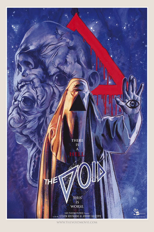
There isn't much to the plot. And by that I mean there isn't really a plot. I think Simon Abrams says it best: "The film's plot is wafer-thin, but that's not the biggest problem. We follow a group of small-town residents, led by rookie cop Daniel (Aaron Poole), as they are besieged by murderous cult members, tentacle creatures/humanoid monsters with hideously deformed bodies. There's not much more to it than that. The cultists and monsters kill and/or transform anyone that opposes them, and human survivors have to kill face-less killers—the cultists wear white sheets with a black triangle at the center of them—lest they become the monsters that threaten their existence."
Now, on the flip side to this movie being a disappointment (at least to me), it did spurn a very kickass run of dope poster art. The artwork was done by Gravillis Inc., who've done several posters you'll recognize, from Logan to The Witch, to Straight Outta Compton to everything in between. It's almost an even lower blow because, in addition to the trailer, this poster really make you want to watch the film and hope for it's success.
The Void is currently available to rent on iTunes, and I would say that it's worth a watch if you want to see some cool effects and waste 7 bucks. If you can go into the film with no expectation, you couldn't be too disappointed; however, the trailer and the cover art does such a good job to hype you up, that this is literally impossible, I think.
Rating: 2.5 vague dimension out of 5.
What did you think of The Void? Was there anything redeeming about it? Was it as hollow for you? What did you think about the special effects? Share your thoughts and feelings in the comments section below, and, as always, remember to viddy well!


